
This comprehensive guide will help you install, set up, and customize your DrivePro Car Driving School Website Template to build a professional, modern, and learner-friendly website for your driving school or training services.
drivora Pro Theme Documentation
Introduction
Customizing Your Website
Global Settings
To set global styles:
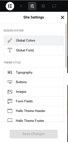
- Go to Elementor > Site Settings.
- Adjust typography, colors, and layout settings.
Header & Footer Setup
- Use Elementor Theme Builder to edit the header and footer.
- Customize the navigation menu, logo, and contact details.
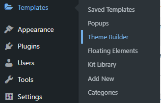

You can drag and drop the elementor widget’s menu first. If you’d like, you can add items or simply drag each one, after which you can add a icon list from the widget and apply a custom style from the style option.
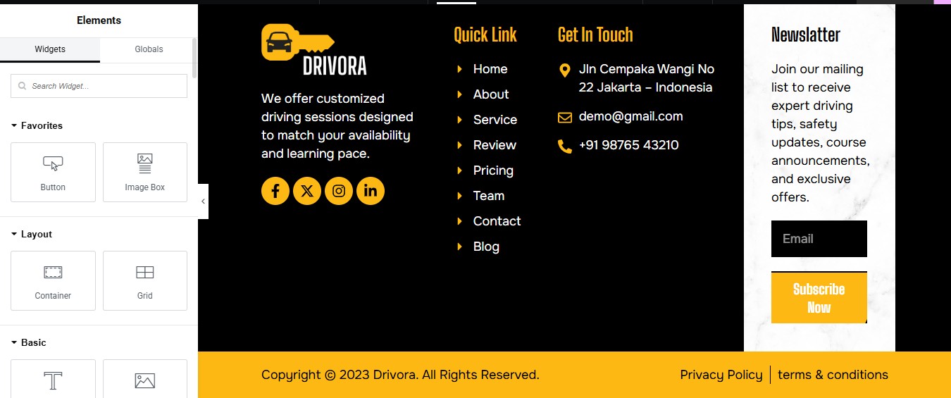
you can add newslatter form, timing, contact details, logo, gallery, menu and if you wish in footer, and create you best design.
Home Page Setup
Using Pre-Built Layouts
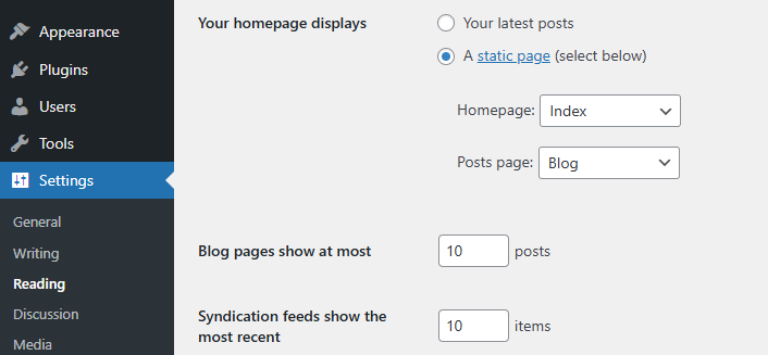
Navigate to Setting >> Reading
Choose the Static Page option.
Choose an existing homepage or create a new one.
Add The Section in home page using elementor
Add components such as these using the Drag & Drop Builder:
- Hero Slider Section
- about section
- service section
- step section
- CTA Section
- achievement section
- why choose us section
- review section pricing section
- team section
- contact section
- blog section
Main Hero Section
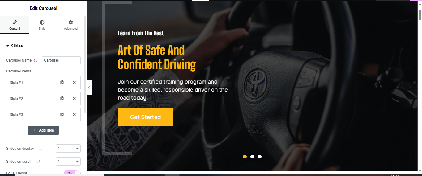
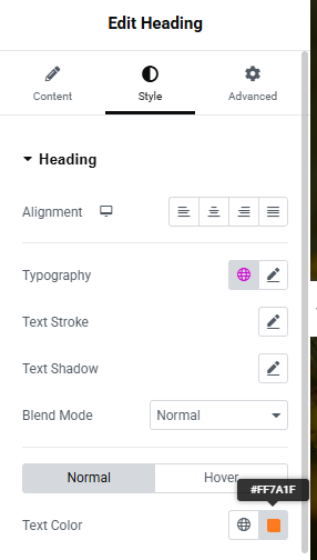
Add the Carousel Widget
- In the new section, search for Slides or Carousel (Elementor Pro or Addon).
- Drag the Slides Widget into the section.
Configure Carousel Content
- Add Multiple Slides: (Slide #1, Slide #2, Slide #3)
- For each slide, add:
- Slide #1:
- Heading 1:
- Heading 2
- Description:
- Button Text: Get Started
- Background Image: Upload an image (e.g., car interior/steering)
- Button Settings:
- Link: Set to appointment/contact page or section ID
- Style: Yellow Background #f8b400, white text, bold
Style the Slides
- Content Styling:
- Alignment: Left
- Text Color: White
- Heading Size: H2 (around 40–50px)
- Description: 18–20px, line-height ~1.6
- Button: Rounded corners, padding 15px 30px
Background Overlay:
- Add dark overlay to improve text visibility:
- Overlay Color: Black or Dark Gray
- Opacity: 0.5–0.6
Customize Slider Settings
- Slides on Display: 1
- Slides to Scroll: 1
- Navigation: Arrows or dots
- Autoplay: Enable for auto-rotation
- Speed: 5000ms is ideal
- Pause on Hover: Optional
About Section
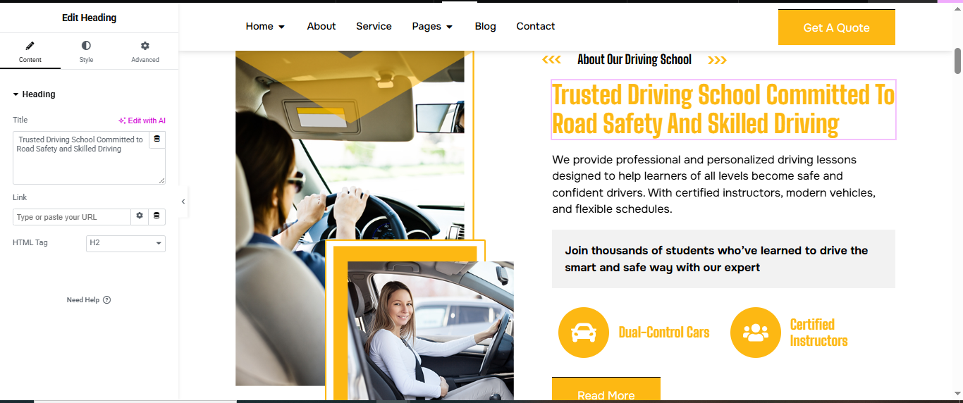
Add a New Section
- Click the ➕ icon → select a two-column layout (50/50).
- Set Content Width to Full Width for a clean, wide layout.
2. Left Column — Insert Image
- Drag and drop the Image widget.
- Upload or choose your photo.
- Align it (e.g., center or full height) under the Style tab.
- For full vertical stretch: Section settings → Height: Min Height, e.g., 600px Image → Advanced → set Vertical Align: Middle
3. Right Column — Add Text and Content
- Subtitle: Drag a Text Editor or Heading widget Set it as smaller text
- Title: Add a Heading widget Use a strong headline
- short description
- Icon Boxes :
- Drag in an Inner Section into the right column → make it 50/50.
- In each column, drop an Icon Box widget for call us and founder info:
- Button: Drag in a Button widget labeled “Read More” Link it to your About page or contact form
Service Section
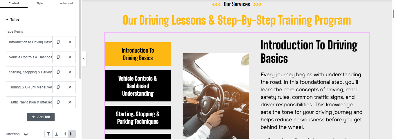
Add Heading at Top
- Drag a Heading widget
- Style:
- Alignment: Center
- Font Size: 36–42px
- Font Weight: Bold
- Text Color: #f8b400
Add Tabs Widget
- Drag the Tabs widget into the left column.
- You’ll see default “Tab #1”, “Tab #2”, etc.
Style the Tabs
- Titles:
- Background (Active): #f8b400 (yellow)
- Background (Inactive): #000000 (black)
- Text: White or Black as needed
- Padding: 15px
- Typography: Bold, Capitalized
- Border:
- Add border between tabs: 1px white
- Radius: 0 or slight (5px)
Add Content to Each Tab (Right Column)
- Use an Inner Section in the right column to manually replicate content:
- Heading for title
- Image of steering wheel/car/learner
- Text Editor widget for content
Icon Section
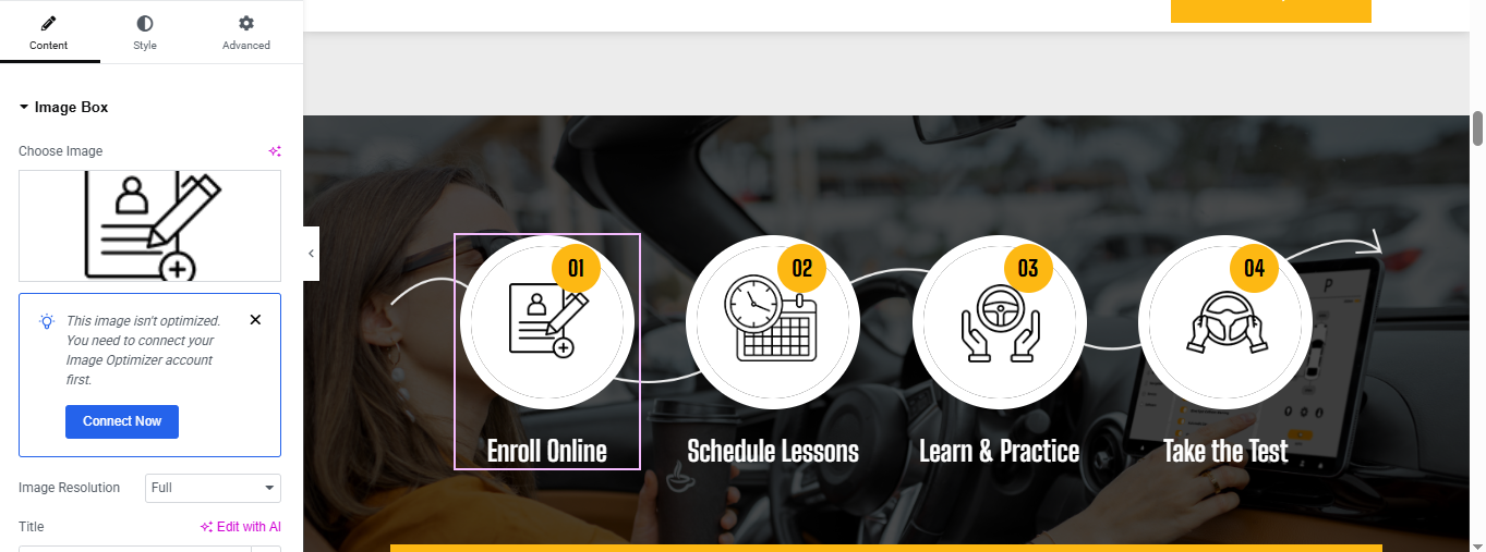
Set Up the Background
- Background Type: Classic
- Add background image
- Background Position: Center Center
- Size: Cover
- Add Content in Each Column
- Drag in an Image Box widget into each column.
- Set the icon image
- Title Text:
- Style tab:
- Image Size: 100–120px
- Image Alignment: Center
- Text Alignment: Center
- Typography: Bold, White
- Add spacing as needed
Add Number Badge (01, 02, 03, 04)
- Use Inner Section + Icon + Text
- Add an Inner Section
- Image Widget
- Text widget
- Style:
- Circular background: #f8b400
- Text color: Black
- Font size: 14–16px
- Border Radius: 50%
- Padding: 10px
- Position it with negative margins or absolute positioning
Add Connector Line Between Steps
- Add border-right or line image manually in between columns:
CTA Section
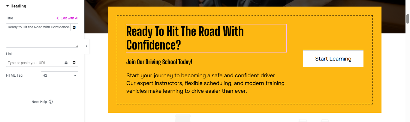
- Insert Content Widgets
- Heading → for the main title
- Text Editor → for the subtitle
- Text Editor → for the description
- Button → for the CTA
Style the Section
- Go to the Style tab of each widget:
- Set font sizes, colors, and spacing.
- Use bold colors for the button
- Add padding around the section for breathing room.
Add Background or Image
- Click on the section → Style tab → Background:
- Choose a solid color, gradient, or image
- Add a background overlay for better text readability.
achievement Section
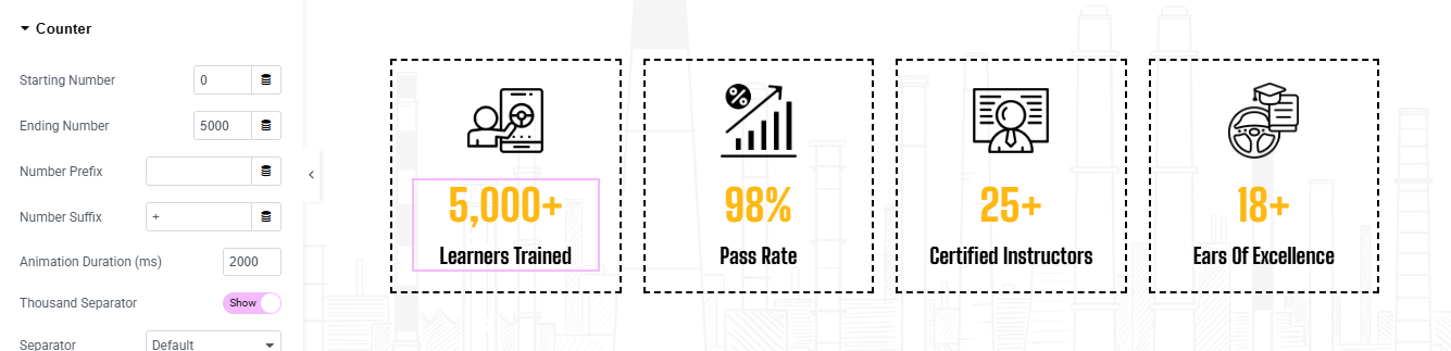
Add Icon + Counter Widget in Each Column
- Drag in an Icon Widget (or Image for SVG icons).
- Drag in a Counter Widget below the icon.
- Starting Number: 0
- Ending Number: 5000
- Number Suffix: +
- Prefix: Leave blank
- Animation Duration: 2000 (2 seconds)
Style Each Counter
- Icon (or Image):
- Size: 60–80px
- Alignment: Center
- Color: Black or #f8b400 (highlight yellow)
- Counter:
- Number: Bold, large font (30–40px)
- Color: #f8b400 (or your brand highlight)
- Label Text:
- Font Size: 16–18px
- Weight: Medium/Bold
- Color: Black
Add Box Styling
- Go to Style > Border:
- Border Type: Solid
- Color: Light grey or black
- Width: 1px
- Padding: 20px or more
- Border Radius: 8px (optional)
- Add Box Shadow for effect:
- Shadow: Subtle gray, blur 10–15px
why choose us Section
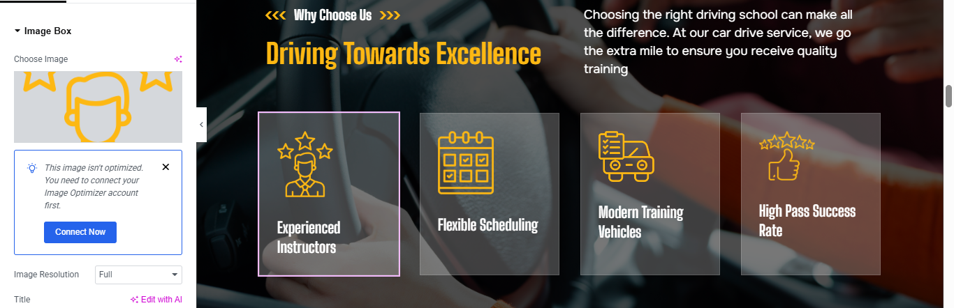
Add Text Content (Left Side)
- Drag a Heading Widget:
- Text:
- Style: Small caps or bold
- Color: Yellow or brand color
- Drag another Heading Widget (for sub-heading):
- Text:
- Style: Large, impactful
- Drag a Text Editor Widget:
Add Icon or Image Boxes (Right Side)
- For Each Feature Box:
- Drag in an Image Box widget.
- Upload your icon (SVG/PNG).
- Set the Title:
- Leave the description empty (optional).
- Align center and make image size around 60–80px.
Style the Boxes
- Image: Set width (60–80px)
- Content alignment: Center
- Title Color: White or light gray
- Font Weight: Bold or Medium
- Select the Column > Go to Style > Background Overlay:
- Use a transparent dark overlay (optional)
- Add Box Shadow for hover effect:
- Shadow color: subtle white/gray
- Hover transition: smooth
- Add Padding to each box: 20–30px
- Add Border Radius (optional): 10px for soft edges
Testimonial Section
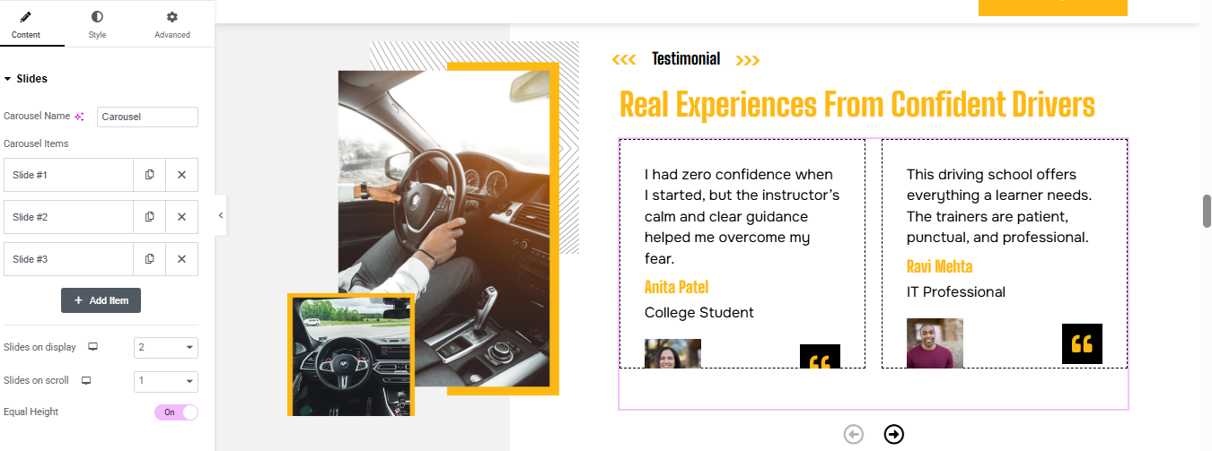
Left Column: Add Image
- Drag an Image widget into the left column.
- Upload a relevant image
- Style it:
- Set width to 100%.
- Add border radius or shadow for visual appeal.
Right Column: Add Title, Subtitle, and Carousel
- Heading widget → Add your main title
- Text Editor widget → Add a subtitle
Configure the Carousel
- Review Text:
- Client Name
- Position
- Image
- Quote Icon:
Style the Carousel
- Style tab:
- Set typography for review text and name.
- Add spacing between elements.
- Customize quote icon color and size.
- Add box shadow or border around each review card.
Pricing Plan Section
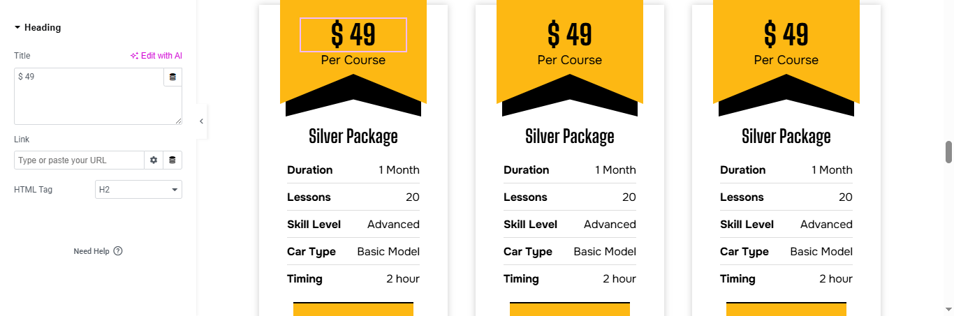
3-Column Pricing Table in Elementor
- Insert Pricing Table Widgets
- If you’re using Elementor Pro, drag the Price Table widget into each column.
- If you’re using Elementor Free, use Icon Box, Heading, Text Editor, and Button widgets to manually build each pricing box.
3. Customize Each Pricing Box
- Package Name: Use a Heading widget or the Price Table’s title field.
- Price: Add the price in the designated field
- Divider: Use a Divider widget or enable the divider in the Price Table style settings.
- Bullet Points: Use Icon List or Feature section to list services
- Button: Add a Button widget with text like “Apply Now” or “Book Package”.
4. Style the Pricing Boxes
- Go to the Style tab:
- Set background color, border radius, and padding.
- Customize fonts and colors for headings, price, and features.
- Add hover effects like box-shadow or scale animation.
Team Section
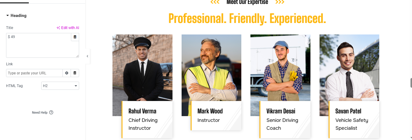
Insert Team Member Widgets
- Use Image widget for the photo.
- Use Heading widget for the name.
- Use Text Editor widget for the designation.
Customize Each Column
- Upload a professional photo of each instructor.
- Add their name
- Add their designation
- Repeat for all four columns.
Style the Section
- Go to the Style tab of each widget:
- Set image size and border radius (e.g., circular profile).
- Customize fonts and colors for name and designation.
- Add spacing and alignment for a clean layout.
Contact Section
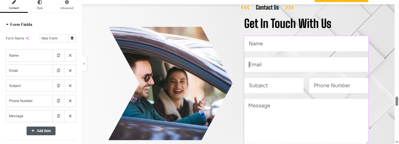
Left Column: Add Image
- Drag an Image widget into the left column.
- Upload a relevant image
- Drag an Image widget into the left column.
- Upload a relevant image
- Style it:
- Set image width to 100%.
- Add border radius or shadow for visual appeal.
- Use padding to create breathing space.
Right Column: Add Title and Contact Form
- Drag a Heading widget → Add your main title
- Drag a Text Editor widget → Add a subtitle or description
- Drag a Form widget (Elementor Pro) or use a plugin like WPForms, Contact Form 7, or Fluent Forms.
- Add fields: Name, Email, Phone, Message.
- Customize labels and placeholders.
Style the Form
- Go to the Style tab:
- Set input field background, border, and padding.
- Customize typography for labels and placeholders.
- Style the submit button with bold colors and hover effects.
Blog Section
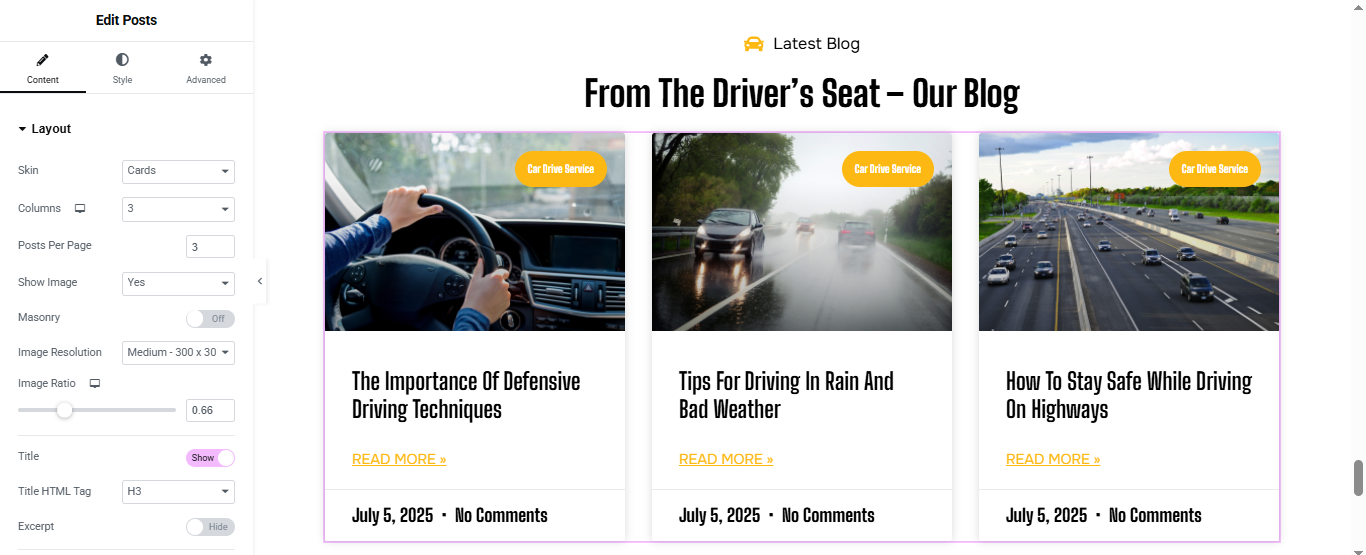
Add Posts Widget
- (Choose method based on Elementor version)
- Elementor Pro (Posts Widget)
- Drag the “Posts” widget into the section.
- Posts will automatically show your latest blog posts.
- Customize:
- Layout: Grid / Carousel / Masonry
- Columns: 2 or 3 recommended
- Show/Hide: Title, Excerpt, Author, Date, etc.
- Image Size: Thumbnail, Medium, Custom
Style the Blog Section
- Use the Style tab to customize:
- Title typography and color
- Card background or shadow
- Read More button style
- Image border radius
Optional Features
- Add Filter by Category (Pro only)
- Add Load More or Pagination
- Add Animations or Hover Effects
logo slider Section

Insert the Image Carousel Widget
- Drag the Image Carousel widget
- Select all logos and click Create Gallery → then Insert Gallery.
Configure Carousel Settings
- Image Size
- Slides to Show:
- Slides to Scroll
- Navigation
- link
- Toggle Autoplay to “Yes”.
- Set Autoplay Speed (e.g., 2000ms).
Enable Infinite Loop for continuous scrolling.
Start your driving journey with confidence and control. At DriveMaster Academy, we provide reliable, results-focused driving programs customized to your needs. Whether you’re a first-time learner or looking to sharpen your road skills, our professional instructors are committed to guiding you every step of the way. Choose expertise, choose safety—get in the driver’s seat today and let’s hit the road together.